Dashboard
Welcome to the dashboard!
This is where you go to get a quick overview of how things are going at your facility or facilities. For more detailed reporting, go to Reports.
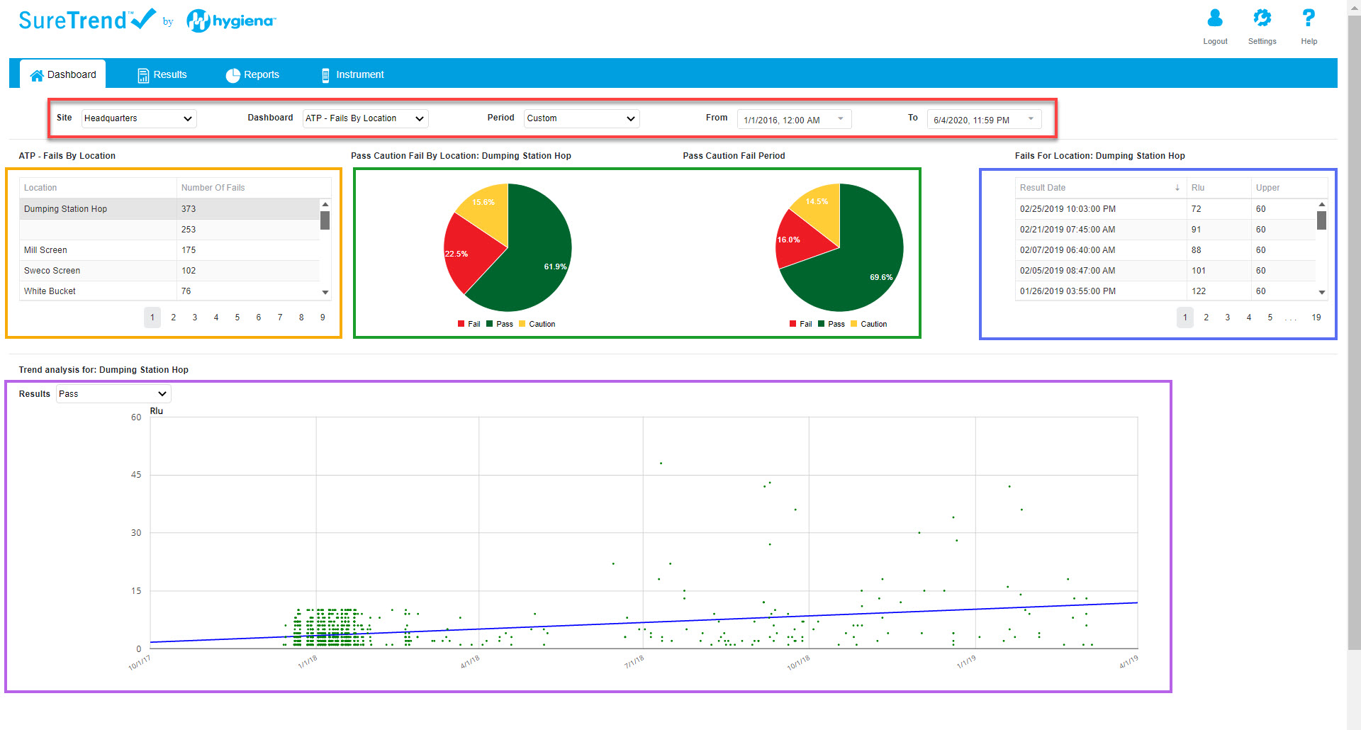
Red Box: These are your filters. Use these to change the data that is displayed on the screen.
• Site: this changes the site (facility) that you are viewing testing data from.
• Dashboard: this is the type of dashboard you are looking at. The example in the image below is of the ATP – Fails by Location dashboard.
• Time: you have two options to control the time/date range. Use “Period” to select ranges such as “last week” or “this year,” or you can use “From” & “To” if you have a specific date range you’d like to look at.
• If you are missing data, it is likely because the period or date range is not broad enough. Or you may need to change the Site that you’re looking at using the first filter on the left.
Orange Box: This data table is interactive. If you click on any of the rows in the table, it will modify what you see in the green, blue, and purple boxes, to reflect the selected data.
Green Box: These pie charts display data from the selected row in the table in the orange box. The one on the left shows all PCF (pass/caution/fail) data whereas the one on the right only shows PCF data for the date range you selected at the top in the red box. This is helpful if you want to see how PCF trends are compared to overall PCF for that plan/location.
Blue Box: This table shows all the fails for the selection you made in the orange box. You can sort them by clicking the header for each column.
Purple Box: Depending on what type of dashboard you selected in the red box (e.g. Fails by Location or Fails by Plan) this chart may be a trendline or a bar graph. You can change which types of results are shown by using the dropdown in the purple box (e.g. Pass, Caution, Fail, All).